Week 6: Test View in Swift
March 16, 2025
Thoughts of the week
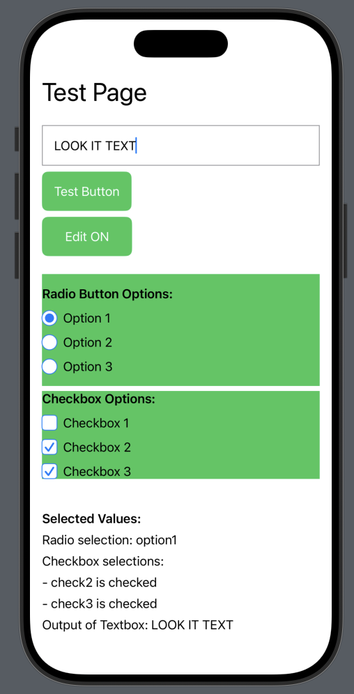
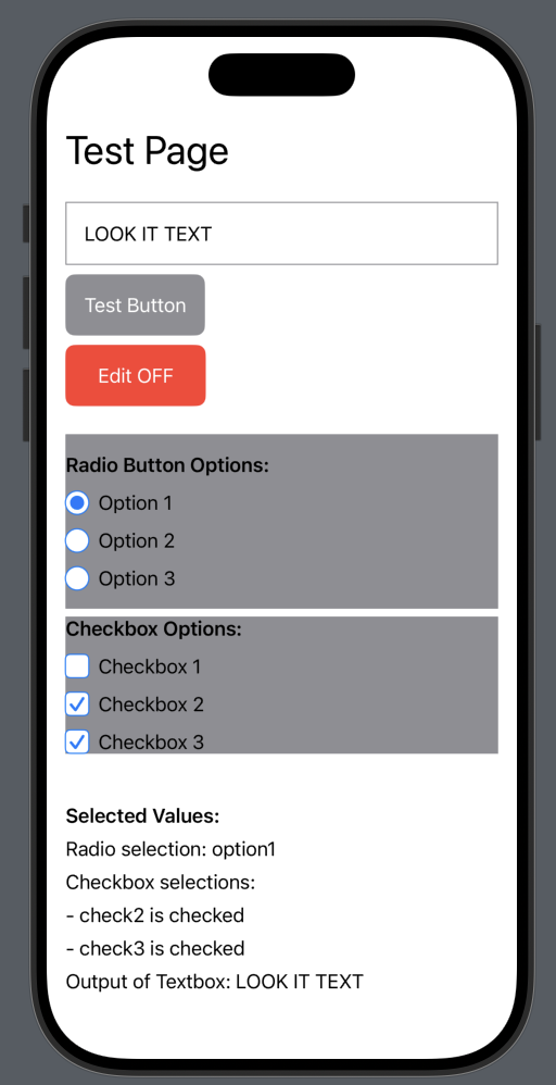
This week, I was advised to have a Swift test page to see the buttons and text boxes and how to set them up. Radio buttons and checkboxes are not the easiest and require setting up your component to handle the data. This is nice because it allows for more customization, but setting up is a bit of a pain.Images
Code
// RadioButton component
struct RadioButton: View {
    let id: String
    let label: String
    let isSelected: Bool
    let action: (String) -> Void

    var body: some View {
        Button(action: {
            action(id)
        }) {
            HStack {
                ZStack {
                    Circle()
                        .fill(Color.white)
                        .frame(width: 20, height: 20)
                        .overlay(
                            Circle()
                                .stroke(Color.blue, lineWidth: 1)
                        )

                    if isSelected {
                        Circle()
                            .fill(Color.blue)
                            .frame(width: 12, height: 12)
                    }
                }

                Text(label)
                    .foregroundColor(.primary)

                Spacer()
            }
        }
    }
}

// Checkbox component
struct CheckboxView: View {
    let id: String
    let label: String
    @Binding var isChecked: Bool

    var body: some View {
        Button(action: {
            isChecked.toggle()
        }) {
            HStack {
                ZStack {
                    RoundedRectangle(cornerRadius: 4)
                        .fill(Color.white)
                        .frame(width: 20, height: 20)
                        .overlay(
                            RoundedRectangle(cornerRadius: 4)
                                .stroke(Color.blue, lineWidth: 1)
                        )

                    if isChecked {
                        Image(systemName: "checkmark")
                            .foregroundColor(.blue)
                            .font(.system(size: 14, weight: .bold))
                    }
                }

                Text(label)
                    .foregroundColor(.primary)

                Spacer()
            }
        }
    }
}
DO NOT PATH
I just thought I would put this here so it sticks in my head. There is no need to get ahead of myself. I would have made a sweet animation here, but there are some things I would like to finish before I get to that.
Useful Information
Next Steps
Tomorrow, I plan to test the beacons' threshold implementation to determine whether a user is close by. There will be an initial call to the API to get all the thresholds of each beacon stored locally on the user's device, which will help with unnecessary calls to the API.