Week Thirteen
Posted on 4/27/2017
Well, today was the day: I gave my final capstone presentation, and now I'm finally done! Just some documentation and printing left to do! I'm proud of what I've accomplished.
Week Twelve
Posted on 4/16/2017
Well, the weeks are counting down until my presentation and until I turn in this project. I'm proud of what I have accomplished, and also know that I'm leaving the project with enhancements that can be done in the future, too, which is pretty cool. This week, I fixed some UI bugs, and added some persistence for day and hour between tabs. I also created a sidebar to view the actual data -- it updates in real-time.
Next week, there are only a few things left to do: Show the timeDiv in a way users care about, add a restart button, and add actual county names to make the sidebar, and thus, the data, more usable. Those are pretty much my last few goals to finish, and then I can start documentation.
Week Eleven
Posted on 4/9/2017
This week, I spent a bit of time on my UI. Now, the map visualization can be stopped and started just by the click of a button. In addition, there is also a footer bar now where users can see the day and hour that the visualization is currently on. Eventually, I'll get it to show days that users care about (example: January 1, 2015), but for debugging, I've kept it showing the number values. This next week, my goal is to get the visualization to start over between tabs, while still remembering the current status of the tab you came from, so that when you return to the initial page, it remembers where you were. However, then I'll also have to add a restart button, so that you're able to restart the visualization from the beginning.
For next weeks goals, I'm just working on more UI updates and functionality, while also adding in the ability to actually view the numerical data.
Week Ten
Posted on 4/02/2017
This week I had a discussion with Dr. McVey and Dr. Pankratz about Vega and what options I had for how to speed up the initial load of my visualization. At first we discussed trying binary files, but, unfortunately, Vega does not allow that file type for their visualizations. However, my next thought was to try to break down my one HUGE file into three smaller files; normally this shouldn't make THAT much of a difference, however, since Vega was loading the WHOLE file initially, it actually made a TON of a difference. I'm really happy with how it's loading now; it went from almost 10 seconds of a blank screen on initial load for each tab to only about 2 seconds, which is a major difference. You can still tell, but now hopefully I should be able to add some sort of "I'm Loading!" notification, so that users know that things are loading. That would be a lot more acceptable now, I think.
My goals for next week are to really work on the UI and add some functionality for being able to play and pause the visualization so that users can then click on a county and see the actual data for it. In addition, there is one county with horrible reporting data, and Dr. McVey and Dr. Pankratz said that I could either do some sort of average of the surrounding counties, or just use data from one of the surrounding counties in place of the bad data so that I don't have to explain the horrible blip on my visualization. I'm happy with their suggestion, because I was definitely getting tired of explaining why one county stayed the same color blue the entire time!
Week Nine
Posted on 3/25/2017
This week, I worked really hard, and am very proud of what I managed to accomplish. First I made three tabs on my map page, one for each sort of data that I am going to be showing: Wind Speed, Temperature, and Pressure. I think I'll be changing the pressure tab to something else, because pressure seems to give what I will call "boring" data. After that, I wrote a parse function that will parse Vega; my parse function accepts inputs like the start_color, the end_color, x and y of the range, and the type of data that I'm sending it. That way, I don't have to duplicate code for each different tab -- I can just call my parse function with different parameters.
In addition, we also had our demo week this week. I was really happy with how my demo went, and with the feedback that I was given. Since that day, I've been able to impliment the different color schemes for each map as suggested, and I definitely believe that it helps to see the changes (look at the temperature tab for the best example, in my opinion).
This next week, my major goal is to get things working a little more quickly, because even though I already cut down on read time significantly, there's still a lot of wait time. In addition, I'd also like to get a side bar and maybe a range/key bar set up in the next few days as well.
Week Eight
Posted on 3/17/2017
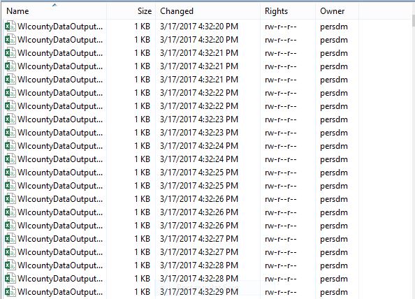
This week I gathered more data. I now have 365 days * 24 hours of data for the 72 Wisconsin counties. Already it seems like the wind direction is more easily seen when watching the animation. However, with this increase in data, it would seem that I have encountered another problem: the way that I had been loading the files for vega (parsing in JavaScript) is just not fast enough. There's a lot of lag, and the animation jumps all over the place. My next plan of action then is to figure out how I can make the animation without having to make a call to the server to get every individual file. If I can do this and then maybe load the data into memory, hopefully things will speed up a bit. Anyways, that's my goal for the next two weeks.
Week Seven
Posted on 3/12/2017
This week I took a bit of a break from the project to catch up on other classes, and life. My plan for this next week, however, still hasn't changed--I'm going to grab some more data to make this thing really animate.
Week Six
Posted on 3/5/2017
This week, I had a real breakthrough -- I was able to write a little bit of jQuery to display my data across time, hooray! I was really proud of myself for that. After doing that, I added a few other things to my UI, such as a scroll bar and a textbox to show which day of the year the user is viewing. I also set up a switch for autoplay to be selected, because we all know that having the animation play right away can be extremely annoying, so this way a user can pick if they want the animation to autoplay or not.
In addition, I also worked on figuring out a better max/min value for Vega to parse. I also added a few more colors, so that a user can see more significant differences. However, the animation still looks a bit choppy, which leads me to my next decision: I want more data! I'm going to try to get, in addition to my daily data for the year of 2015, hourly data for the year of 2015. That way, I think we'll be able to see windfronts and directionality even better than we can looking at the animation now. I'm really excited to work on that, and then in the upcoming weeks I'm hoping to add interface elements so that the user can pick if they want to see the animation by day or by hour, and then allow them to see across either an entire month, or the whole year.
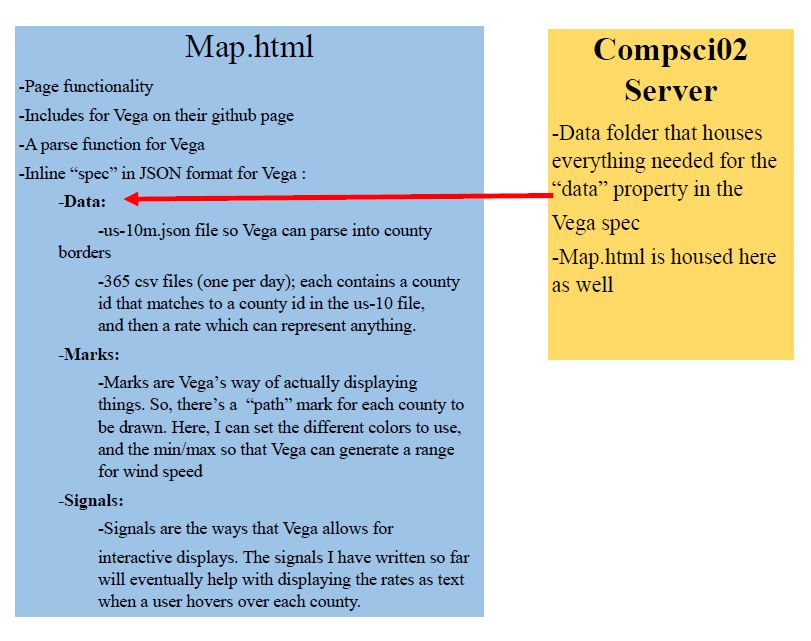
Finally, I also made a diagram to show sort of how Vega and my animation are working so far. Not only did this help me remember how each of my files are interacting, it will also help to explain to other curious programmers what I'm doing. You can see the diagram below!
Week Five
Posted on 2/26/2017
This week, after deciding I had to scrap my data and start over, I discovered the Dark Sky weather API. Using this, I was able to get data for each county in Wisconsin for each day in 2015. I could have done 2016, but wanted to leave a long enough gap from today so that hopefully most of the data would actually be filled in, unlike the data that I got from NOAA.
Because of the way that I am now obtaining my data, I also decided that it would make sense to use a database. So, I set up a Microsoft Azure server that is hosting a MongoDB (noSQL) database. A MongoDB database is different from a typical SQL database in that SQL databases have tables and rows, whereas MongoDB has collections and JSON documents. There was a bit of a learning curve for me here, but I was able to quickly figure things out even though I had never really used a database of any kind before. So, I created a collection for each county, and then each day of weather data is stored in its own JSON document.
Finally, using the database that I had created, I was able to query and use Python to create 365 csv files, each containing a county id and a piece of climate data (I finally decided on windspeed because it seemed to have the best data)--one for each day of 2015. I had to do this because csv files with a (county id, value) pair are how Vega loads data to visualize it.
My next step here is to figure out how to show the data that I have for windspeed across time. So, I'll be working on my user interface for the next week or two, and figuring out how to display a color key, and few dropdowns for a user to select which timeframe they want to see, and then finally, the scroll bar across the bottom to drag and change which day's data the user is looking at. Yeah, that'll definitely keep me busy for a while, and then my goal after that is to figure out how to make the visualization autoplay an entire year's worth of data.
Week Four
Posted on 2/18/2017
This week I realized one thing: I hate my data.
The data that I have, although it seems like it would be enough, just isn't. Because I got the data by reporting station, showing it by county is really just not working -- there are too many counties without stations. Dr. Pankratz suggested that I could do some sort of radius from the station so that I wouldn't just have some totally white counties, but I'm more inclined to think that there just has to be some better data for all of Wisconsin that I can turn to.
In terms of successes, I rewrote my entire Python file so that it's not only more cohesive, but also just more readable in general. Oh, and one more plus: the (very) basic calculation that I did actually seemed to work this time! So that means that I'm finally loading things correctly into and out of my data structures and data files, which makes me happy. This upcoming week I will be continuing my search for better data to work with, and going from there. I'm hoping that with better data I'll also be able to move at a quicker pace with actual coding.
Week Three
Posted on 2/12/2017
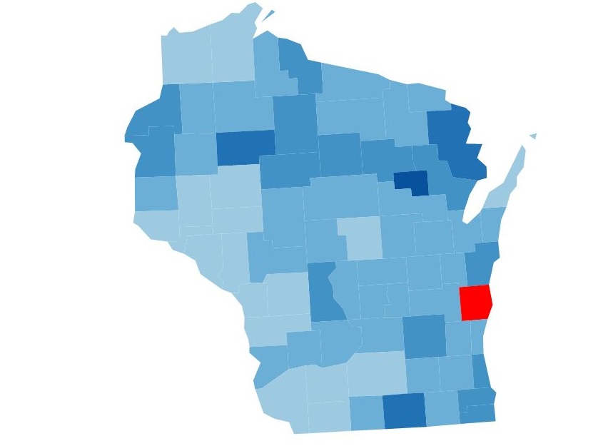
This week, even with my change in game plan, I feel very successful. Over the past week I was able to strip the correct data for wisconsin out of the files that were there; then, I was able to actually get the Vega code running on the compsci02 server under my public_html page (there now for testing, so that the whole world doesn't know when I mess up!), and it displays the map of WI divided up by county! I was really proud of myself for accomplishing this.
In addition, I also decided that showing data by reporting station doesn't make sense, because a lot of people would not be interested in that information. So, instead, I used the Google Maps API to reverse geocode the latitude and longitude points for each station, and figure out which county they were in. Initially, I was running into issues because I was making too many calls to the API in too short of a time period. So, I used sleep() in order to postpone the calls to the API, and then was able to get all of the data that I needed. Finally, I saved this data to a file, which I can use now in place of the API so that I don't run into the same time issues as I did this past week. Below is a picture of my WI map in Vega.
Week Two
Posted on 2/4/2017
Well, it's the end of Week 2 already. This week, I talked with Dr. Pankratz and he said that I am trying to do too much, and that I had to decide on what location/data that I wanted to use. Right now, I've decided that I want to try to visualize Wisconsin, using snow and rain data. I think that's a good start, and then if I manage that, I can do more with it.
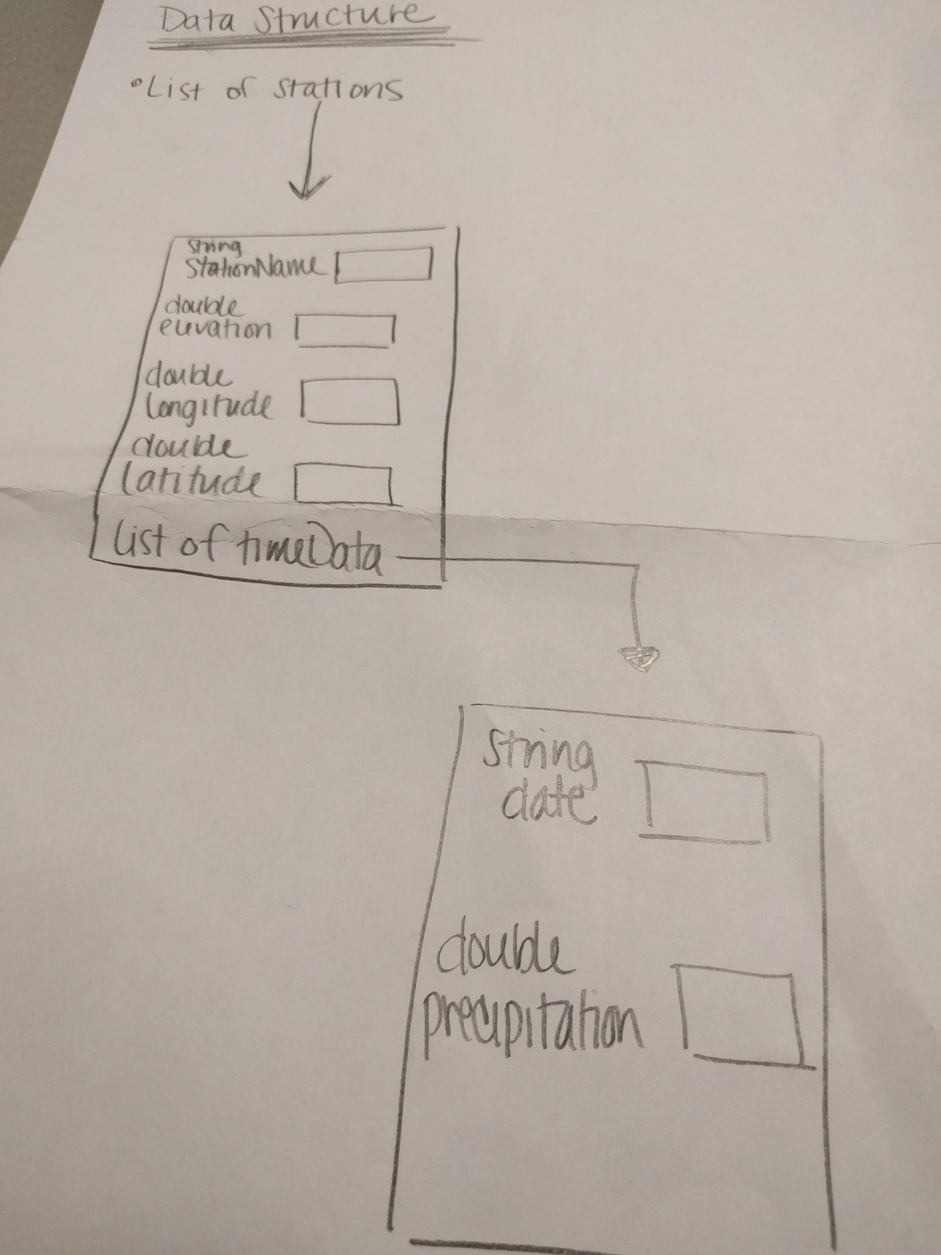
Dr. Pankratz also told me that I needed to draw my data structure, which I did. You can see that below. However, I might be changing that in the near future based on the other research that I did this week... I was trying to figure out how I'd actually end up visualizing the data in the end, and stumbled upon Vega . I think this could be an awesome thing to use for my project, because then the hard thing wouldn't be actually writing the visualization from scratch, but instead, learning Vega and trying to get Vega to do what I actually want it to. Which has already proven to be difficult, but I'm not giving up yet.
My plan for next week is to get Vega code running locally on my webapp, a tutorial example, just so that I know that it can be done before I go off writing a ton of Vega code that I'll never actually be able to use.
Week One
Posted on 1/28/2017
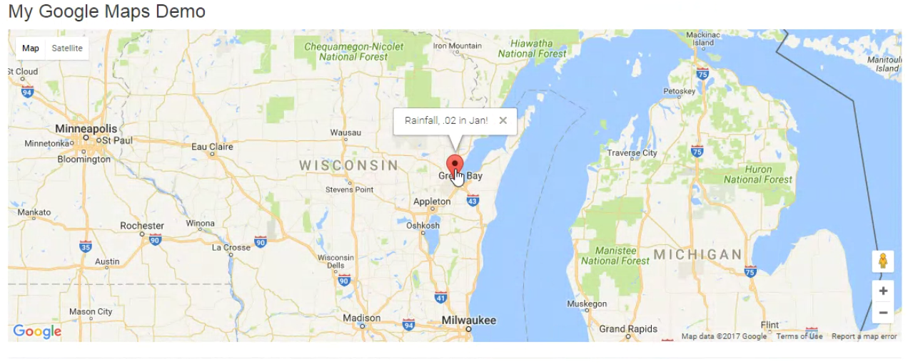
Week One is almost complete. This week I worked hard on trying to get a head-start and figure out my plan of action for this project. I submitted a few requests through NOAA (see: Link) for some climate data. All of those requests are still queued, so I'm still waiting impatiently.
Since I don't have any real data to work with yet, I have spent my time trying to learn my way around the Google Maps API. My goals were to be able to mark a longitude/latitude location on the map with a marker, and then display something when you hover over that marker. Although this won't be quite what the final project requires, I at least know that I'll have to be able to locate places on a google map for display, and then also be able to show data on a mouse hover. Below you can see that I've accomplished this!
Receiving My Project (UPDATE)
Posted on 1/26/2017
It's here! My project definition is finally here, at 5:43 a.m. I'm so excited to open it up and read what it is.
Animating Trends in Climate Data. I cannot express enough how excited I am. (Hint: REALLY excited). My first plan of action is to meet with a Professor of Geology and Environmental Science here at St. Norbert College. Hopefully he will be able to enlighten me on the intricacies of climate data so that then I will be able to decide exactly how to approach this.
Receiving My Project
Posted on 1/25/2017
I am patiently (or, rather, impatiently) waiting to hear what I will spend the next three months working on. They promised that they would tell us today, but just a few moments ago, they asked for an extension... I will update with another blog post as soon as I am clued in to my actual project.