Now here’s the tough part. The design.
With some time to think, I’ve deliberated in what I hope for the final product to look like.
A
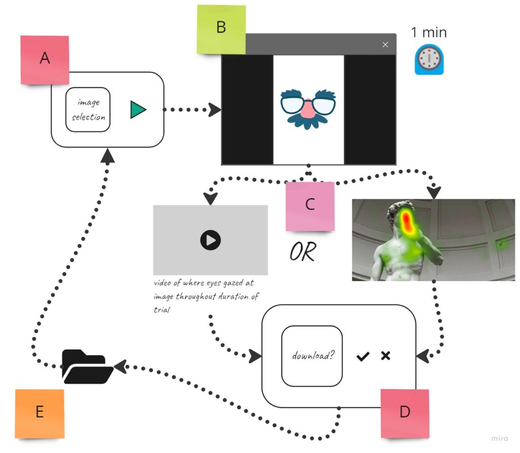
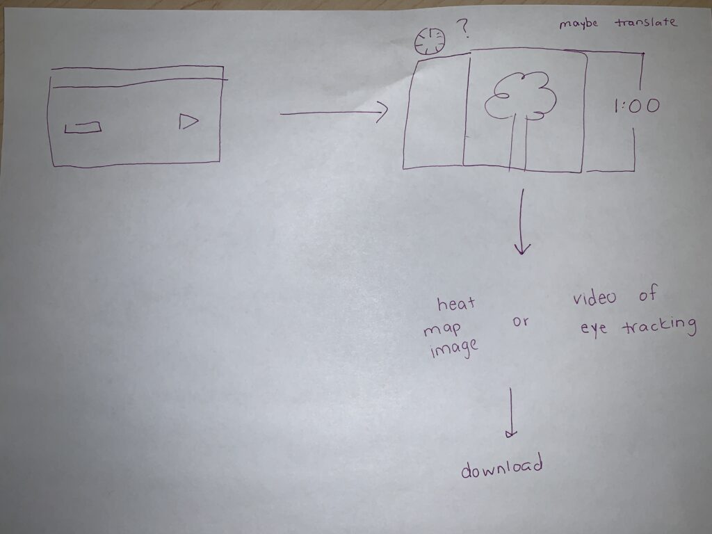
The user runs the application and the start menu appears. The user selects an image for the user to look at during the trial.
B
After selection, the start menu disappears from view and the trial begins. The user looks at the image for a minute while the application tracks the user’s eye movements on the image.
C
To be decided. The application will either return a video of the eye tracking movements of the image or a heat-map image.

D
The user can now choose whether to download the video/image or to discard it.
E
If the user chooses to download, a file explorer will prompt the user to select where to download the video/image.
After either downloading or discarding, the user will be sent back to the start menu either to use the same image again, or to select a different image for the next trial.
For now, this is the game plan. I’m definitely not married to anything just yet, but any thoughts or considerations would be greatly appreciated.

Leave a Reply