This week focused more on fixing the little errors of my site, but also allowed me to get feedback from the class and add some of the new features from my walkthrough presentation.
New Features
After walkthroughs, there were a few new features I wanted to add. I also asked the class for more feedback mainly on some user interface issues I was having and fixed some things based on that conversation as well.
Adding Temperature Change Each Year
The main feature I added was a temperature change each year option on the dropdown. This takes the current year’s data and subtracts the previous year’s data to show the difference from one year to the next. I also updated the temperature change over time option to use the start year the user entered as a baseline. Instead of being allowed to start at 1743, I instead restricted the two temperature options to start at 1850, when every state (except Hawaii) was guaranteed to have data.
Rewind 5 Years
Another feature I added was when the animation is paused, the user can rewind five years. The button only appears when the animation is paused and then disappears again when resumed or stopped. This was a suggestion from walkthroughs that I really appreciated and agreed with and was excited when I got it working.
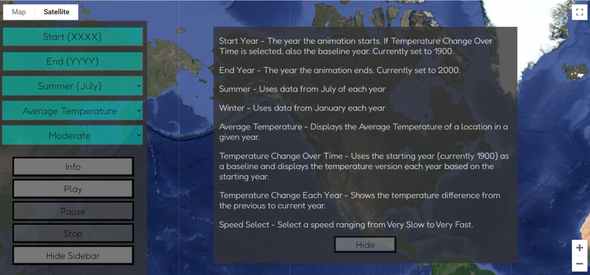
Adding an info button and option
Lastly, I added an info button and created a new div that explained the options much better. This also takes up the majority of the screen and allows the user to read it much better than the alert box I had previously. You can see what this looks like in the image above.
The Little Things
Throughout the rest of the week, I fixed a wide variety of little errors I encountered, some of which led to another list of errors.
These errors I was able to fix include:
- The coloring of buttons when inactive
- The color did not change when rewind was pressed
- Values of the input boxes do not show start and end years when animation is running
- Allowing the animation to run with bad year data
- Not having the Fahrenheit equivalents to the keys to make it easier to read
- The spacing of the sidebar so five buttons and five input boxes can fit
- Not allowing the “Stop” button to clear the data when the data animation has been completed
- Correcting the order of subtraction for the change over time data (I had it backward)
- The key trying to show without the play button being pressed (it never loaded an image)
- The current year text was too far from the animation (I decided to center it on the top of the screen)
And probably the biggest error I had to deal with this week that I think I might have finally figured out is the spacing of the key on the bottom of the screen. I was trying to use padding and forced margins to make the key in the correct spot. However, I was using the same control location as the buttons on the lower left, so when the user zoomed in, the buttons jumped up. I hid the Keyboard Shortcuts and Terms of Use from the bottom right corner and was able to anchor the key from the bottom right instead of the bottom left. I have to fix the margin on the larger key when the sidebar is hidden, but the smaller main one should be fixed. I want to do some more testing on different size screens to confirm, but it seemed to be working on mine.
Next Steps
The major requirement I have not met yet is to implement data smoothing. However, the more I research this, the more I do not know if this is possible in Google Maps. The first step I want to do is draw a circle of color for each state and have it change based on the data.
Even if I cannot figure this out, I think my project is extremely close if not fully ready for presentations in three weeks! I am hoping to take a bit of my Easter break to start creating my presentation.