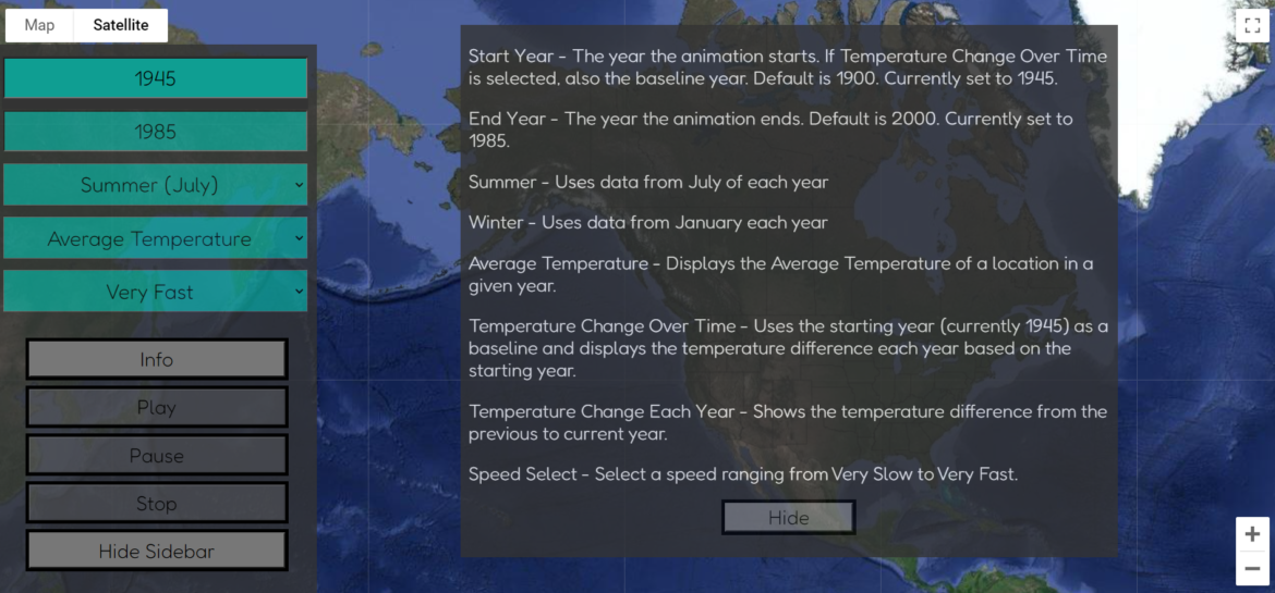
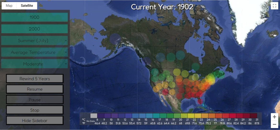
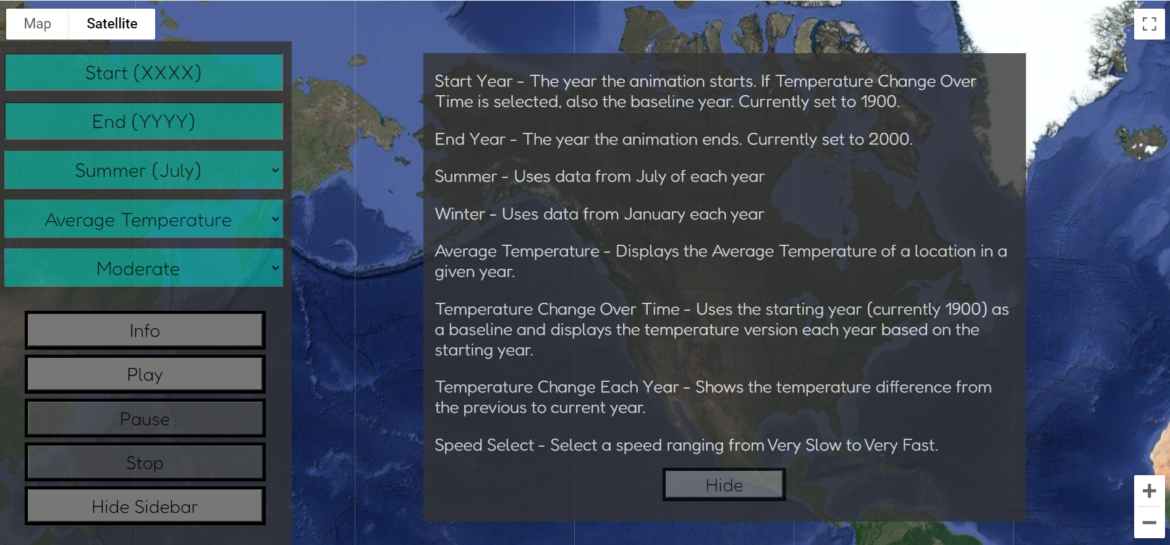
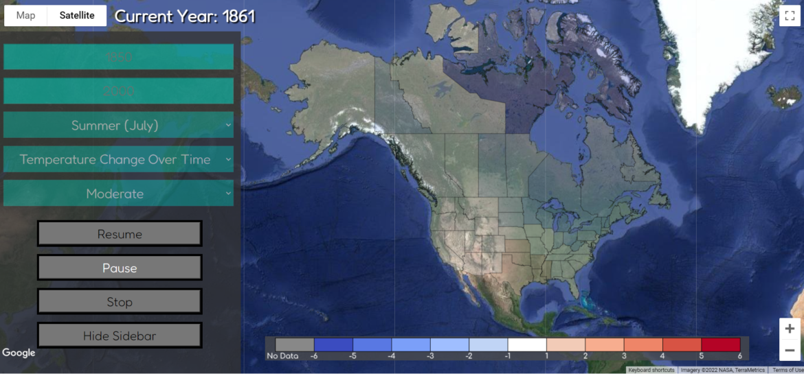
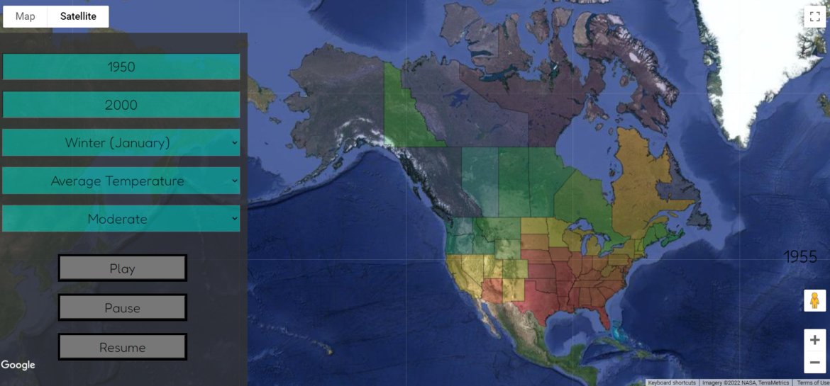
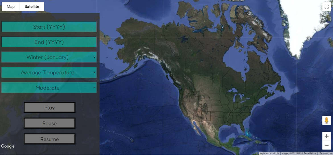
This week was a big one…it was finally presentation week. I tried not to add anything new to the project, but I was able to fix a few more small bugs and prepare. (Hopefully) the last of the bugs The main final bugs I kept finding were the buttons reappearing at random times when the sidebar was reshown. On Friday night when recording a video demo just in case, I realized it is because I never changed the criteria for what button should be shown…Continue Reading “Week 14: Presentations(!!) and Reflections”

This week mainly focused on finding and fixing as many errors and bugs as I could find. I also enlisted the help of some friends to break my project, and a few of them succeeded. Fixing the Circles Although I am presenting the original version that uses the state outlines, I wanted to fix up the circle version a bit to present it as an extension for the person who would have it next. After a lot of trial and error, I was able to…Continue Reading “Week 13: The Home Stretch”

This week wasn’t filled with as much progress as I was hoping for, but I was able to try starting the process to create some data smoothing. I think the way I want to accomplish this is by drawing circles onto the map where they slightly overlap. I made a rough version of this earlier this week by finding the center latitude and longitude of each state and drawing a circle with the corresponding color. You can see the rough version here: https://compsci04.snc.edu/cs460/2022/nooycr/circles/ There are…Continue Reading “Week 12: Playing with Circles”

This week focused more on fixing the little errors of my site, but also allowed me to get feedback from the class and add some of the new features from my walkthrough presentation. New Features After walkthroughs, there were a few new features I wanted to add. I also asked the class for more feedback mainly on some user interface issues I was having and fixed some things based on that conversation as well. Adding Temperature Change Each Year The main feature I added was…Continue Reading “Week 11: Adding More Features”

One of my favorite parts of creating applications is making the small design and bug fixes to make the program more user-friendly, which is what I got to do for the majority of the week. With the help of Dr. McVey, I was also able to fix my data passing issue, which is huge! Thursday was also walkthrough presentations and if you want to hear some of the suggestions I received you can check out my post here. Moving the Current Year Surprisingly, the hardest…Continue Reading “Week 10: The Little Things”

Yesterday (Thursday, March 31st) was our walkthrough presentations. This gave everyone a chance to present their current progress on their project and get feedback from their classmates and professors. I feel like I have made decent progress on my site that I presented and got a few good pointers. New Additions There are a few good suggestions that were made that I’m excited to try to add. The first addition is an option where the coloring of each state is based on the year directly…Continue Reading “Walkthrough Recap”

This week I finally got the data reading in correctly and displaying to the screen. There are still a few issues and wrinkles to work out, but overall I am happy with the current progress. The Progress The first win of the week was being able to see that the data was being sorted through and encoded correctly after the help of Dr. McVey. Knowing that the data was being read through correctly was very promising! Secondly, I was able to get the states to…Continue Reading “Week 9: Houston, we have Color (and Animation)”

With this week being spring break, I was able to dive into my project a bit more. I had lofty goals for this week, but thanks to a slight injury to my shoulder, I was sidelined for much longer than I would have liked. Anyway, I was still able to make a few major steps in progress. The main thing I worked with this week was Jared’s code and learning what each section did. However, my input files looked quite different than his, so I…Continue Reading “Week 8: Creating Some Structure”

This week I finally feel like I have made progress! I spent the majority of the week fighting with Excel to format the data I found to match what I think will work best to read into my program and display the information. Original Data The data set I am using was found on a website called Kaggle. It is titled, “Climate Change: Earth Surface Temperature Data” by Berkeley Earth. It has four main Global Land Temperature Excel files: by city, country, major city, and…Continue Reading “Week 7: Formulas, Data, oh my!”

The start of this week was slow going because I could not figure out how to get an API Key. However, after setting up a new billing account on Tuesday, I finally acquired the API key. After following this Simple Map tutorial, I was able to get a map to load using JavaScript and HTML. I changed the center of the map and the zoom to focus on North America because that is where the data I am starting with is located. You can view…Continue Reading “Week 6: A Fresh Start”