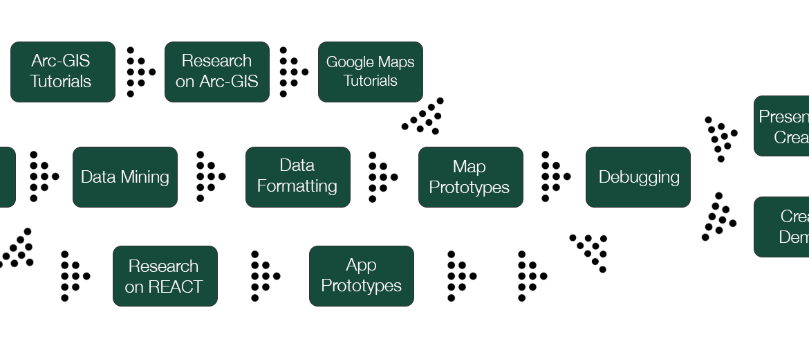
Yesterday (Thursday, March 31st) was our walkthrough presentations. This gave everyone a chance to present their current progress on their project and get feedback from their classmates and professors. I feel like I have made decent progress on my site that I presented and got a few good pointers. New Additions There are a few good suggestions that were made that I’m excited to try to add. The first addition is an option where the coloring of each state is based on the year directly…Continue Reading “Walkthrough Recap”

Gantt Chart The Gantt Chart focuses on specific dates and how long each section of the project is going to take, making it very similar to a timeline. PERT Chart Meanwhile, the PERT Chart focuses more on the process of creating the application instead of focusing on the specific timeline. Which is better? For my style of planning, the Gantt Chart I think is going to work better for me. However, I do appreciate the process that is shown using the Pert Chart because I…Continue Reading “Gantt and PERT Charts”

Earlier this week each person received their capstone projects that will be created over the course of this semester and presented in late April. My project is about visualizing data related to climate change and interpreting that data in easy-to-view ways. If you want to learn about my project in its entirety, click here. First, looking at the project, I had no idea where even to begin and quickly panicked. But, after a night’s sleep and talking to a few people much smarter than me,…Continue Reading “My Initial Thoughts”