This week I finally got the data reading in correctly and displaying to the screen. There are still a few issues and wrinkles to work out, but overall I am happy with the current progress.
The Progress
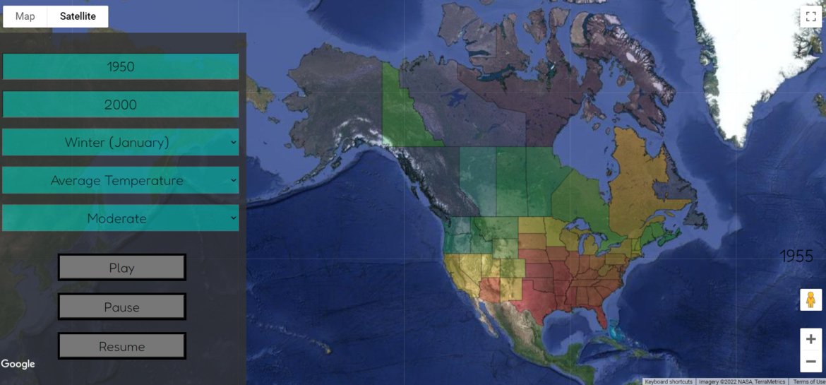
The first win of the week was being able to see that the data was being sorted through and encoded correctly after the help of Dr. McVey. Knowing that the data was being read through correctly was very promising! Secondly, I was able to get the states to fill with their individual colors this week. It took a lot of debugging and finding some rookie mistakes, but I was able to make it work in the end.
For the longest time, Canada did not want to change colors and kept coming up as undefined. I realized this is because when I combined the two GeoJSON files, the STATE_NAME property that was coloring the US states didn’t exist in Canada, so I had to make sure to add those into the property section. It still didn’t seem to be working, but after sending it to someone else to check it out and it working for them, I realized I had not closed out of my browser in too long, and the cache needed to be cleared.
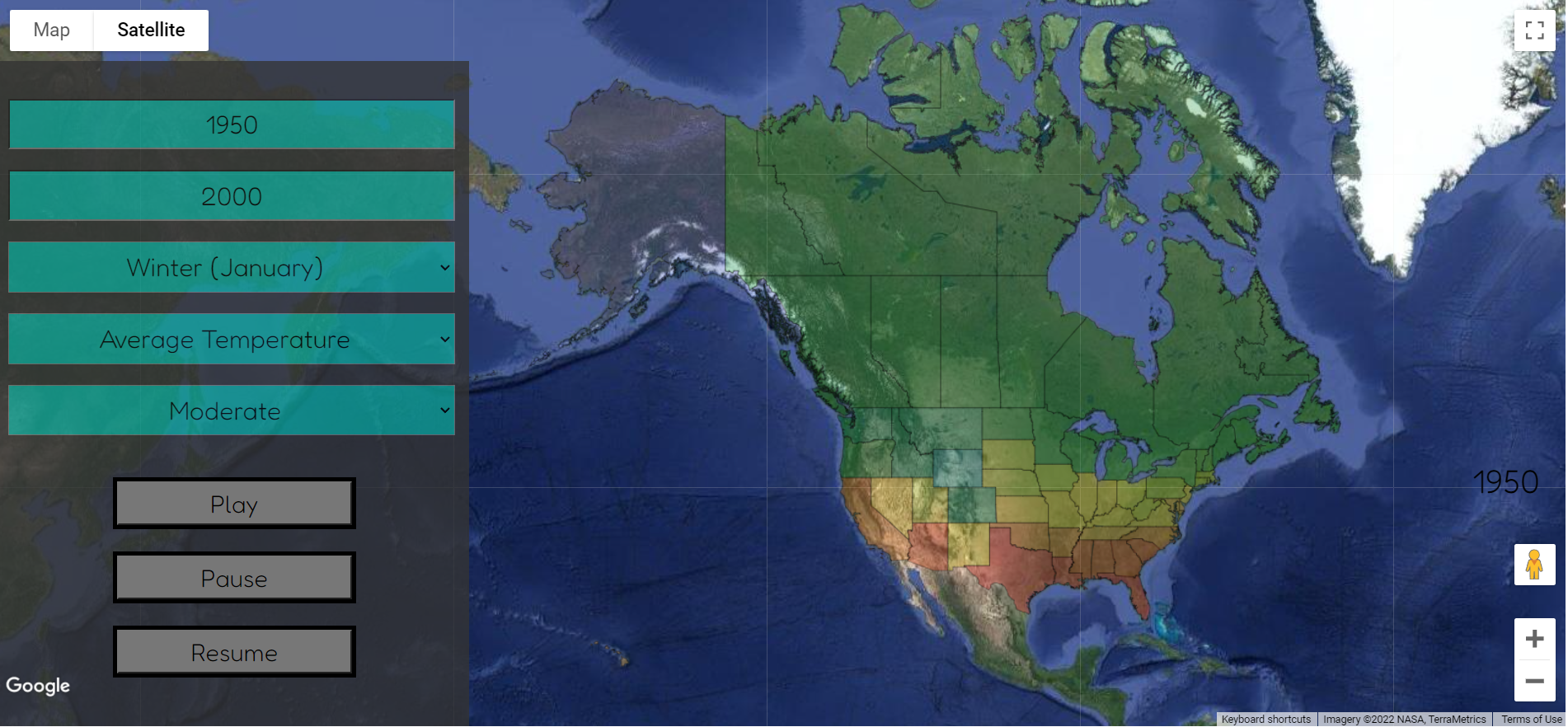
After getting the color to work for the year 1950, I added a few more years of data and was able to get a slight animation working for the six years that I have. I am incredibly hopeful that once my data issues are solved (see below), I will be able to have a working animation in no time. Right now I am planning to go and fetch the new data array each time, which I know is not efficient, but it is a start. Eventually, I am hoping to pull around 5-10 years at a time and send the next while the animation is running.
Overall, a lot of the week was learning how to better debug and use the console, and thanks to Dr. McVey and Nick, I have a much better handle on using JavaScript and PHP.
The Issues
Although the data is encoding correctly, the data array is not correctly getting sent back to the JavaScript file, which means none of the colorings can be correctly applied. Because of this issue, the data right now is hardcoded into the JavaScript files for the years 1950-1955. Most of the examples I was looking at had both the PHP and JavaScript code in one file, so I might have to go that route and combine two of the files. Once this issue is fixed, I have hope that the animation at least for the Summer Temperature Data would work for any entered years.
After debugging for a bit too long, I was realizing that the index value of the color array was always returning 45 or 47. This was because I was using the Winter data array instead of the Summer data which meant almost every temperature was at the top end of the range. To make it work, I hardcoded in using the Summer data, but have to work on getting the data from both drop-down boxes and setting the data array correctly.
What’s Next?
Besides working to fix the few issues I have been encountering this week, I also want to work on creating the key for each data set so the user can understand what the colors mean. The current year right now is on the right side above the zoom, but I don’t love that location, so I want to try moving it up to the top left next to where the base map options are.
The other major project of this weekend and next week is to create a presentation and prepare for walkthroughs that are occurring next Thursday, the 31st.
Hi friend!