Because of the struggles of last week, I spent this week creating a new plan after shifting to a new platform.
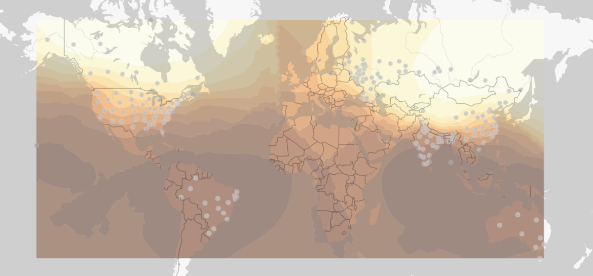
But before fully switching to Google Maps, I met with Krissy and she gave me a few ideas that I might plan to use as a supplement. Krissy pointed me to using Arc-GIS online instead of the desktop application and I found out it is much more user-friendly. You can update a variety of files to create points including a CSV. Then, there is an analysis tool called “Interpolate Points” which creates a smoothing of colors throughout the map. You can see the example I made from one of the data sets during the month of January, 1990. This was one of the smaller data sets, so if I do decide to use something similar I would try to pull from the larger one.

There are still a few issues to this method, which is the reason I don’t think this could work for the actual project. I really don’t like how the smoothing stops at the edge of the data points instead of stretching the whole map, but I think it is a better option. Mainly, the animation part is still the main issue with using Arc-GIS along with when you try to emded the map it asks you to sign in before being able to view the map.
However, using something similar to this feature I think would be a cool way to show the difference from the earliest data to the newest. Just as an example I used my old pointed map from last week and the new smoothed map from this week so they don’t line up. Also, the resolution of the two images is not good, so if I would do this for real, I would make sure to take a better screenshot.
Moving On
Starting this weekend, I am trying to move over to Google Maps. The student who worked on a project similar to this in the past (you can view it here) used Google Maps and JavaScript, so I know it can work for a variety of the things I need it to.
Really the only thing I’m not sure that will work is the data smoothing that Arc-GIS has. I might try to do something similar to the dots on my old map to create the varied look across the map. The other problem that I think may occur is not having a lot of data in the far north and south. However, each of the data sets I am using has a variety of cities, so I could try to combine all of them to use as much data as possible.
However, I am still hopefull that Google Maps may be the solution because I am hoping it could incorporate a time slider, animation, and color changing. Looking at Tyler’s code, I think I understand a large amount of how it works and I’m excited to try to dive in and create as much as I can over the next few weeks.